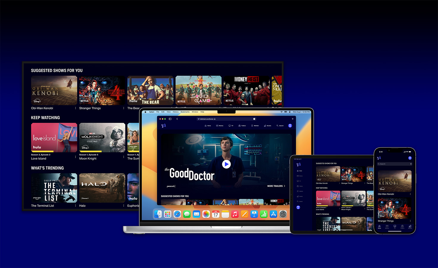
Blockbuster Ticket
During my summer 2022 internship at Siegel+Gale, I led the product design for a cross-collaborative intern project to model and present an aggregate streaming service product under the revitalized Blockbuster brand. My role as the Experience intern was to develop user interface prototypes in conversation with strategy and creative research. This project was led under the guidance of Jared Fink and Amy Chen.
The Problem Space
The fragmentation of streaming platform content
The streaming service market has become more competitive and fragmented than ever. Our task was to create a product proposal that could provide a solution to content fragmentation.
First Steps
Competitive Market Analysis, User Interviews & Survey
Our first steps involved conducting competitive market research of the streaming platform industry to better understand the positioning for Blockbuster’s potential offering, while user interviews were conducted to better understand the current streaming experience, as well as a nationwide survey of 137 respondents.
Competitive Research
Research was conducted on the major streaming platforms on the market and their growth.
User Interviews
User interview questions formulated as a team to better understand the streaming experience. Interviews were conducted following set guidelines on users with several streaming subscriptions.
User Survey
Quantitative surveys were conducted nationwide via a digital survey platform to better understand the streaming experience.
Findings
Survey & Interview Findings
We gathered key statistics from our surveys and interviews that capture user sentiment that inform our design development goals.
46%
of viewers say that the increase in streaming services makes it challenging to find the content they’re looking for.
64%
of viewers say they would prefer a bundled streaming service that would allow them to choose as few or as many streaming services as they wanted.
58%
of streaming service subscribers with over 3 subscriptions or more, previously being only 32% in 2019.
User frustrations and whitespace on the market
After concluding that an overly dispersed market has not only burdened users’ experientially and financially, we showed there was whitespace for Blockbuster to create a unique identity as an aggregator streaming service that could solve these frustrations and disrupt the conventional paradigms of exclusivity and value that characterize conventional streaming platforms.
Gathering user insights
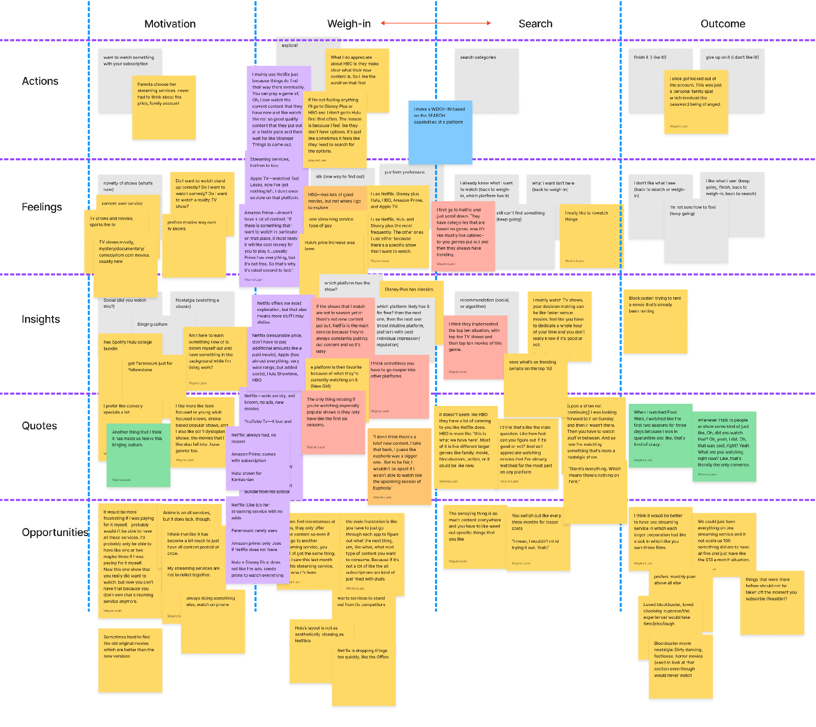
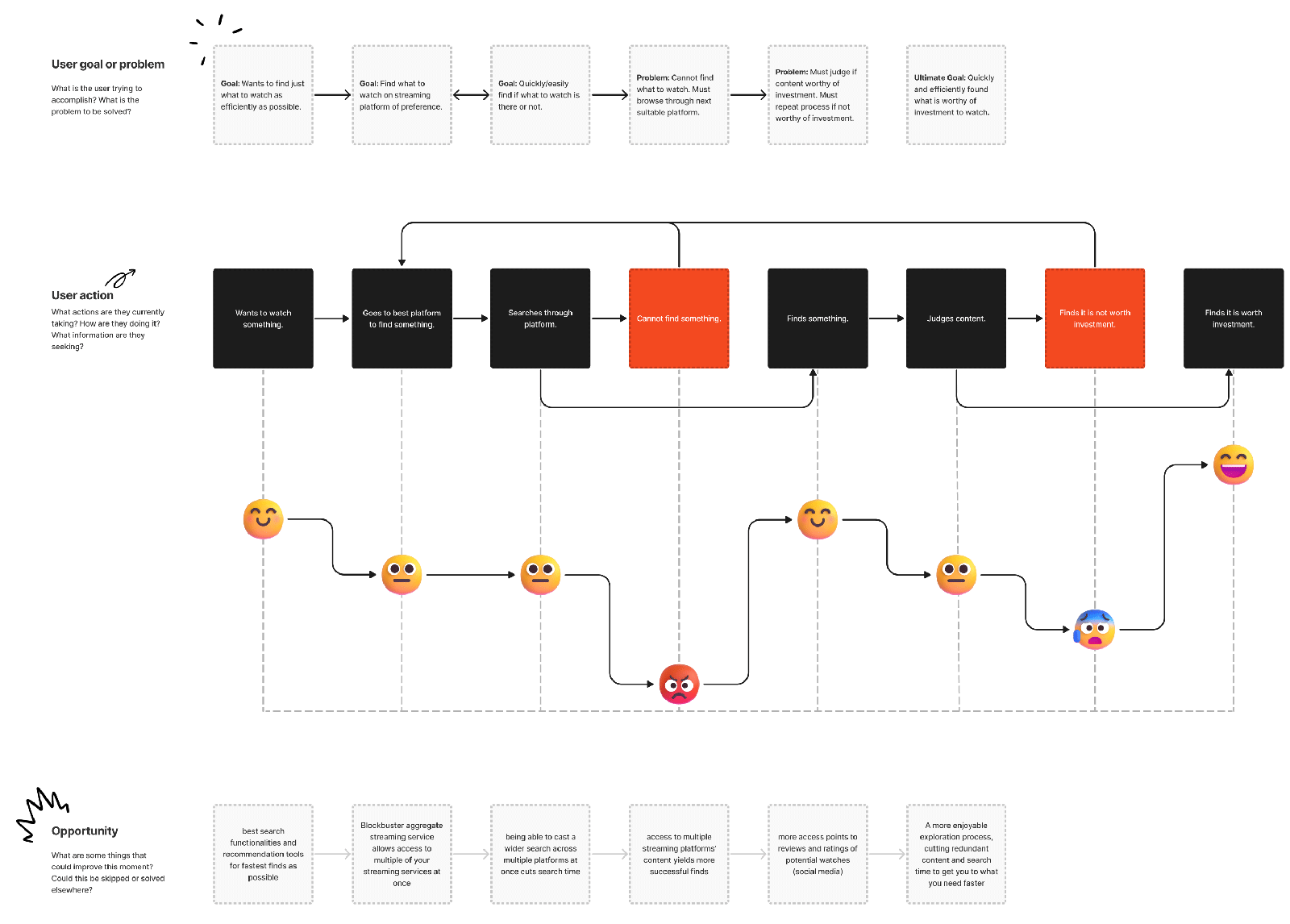
We synthesized key experiences captured by our 20+ interviews and organized them across different swim lanes detailing the content discovery process on streaming platforms, organizing them by an overarching process found across all users’ experiences—an initial motivation to watch content, search & weigh-in processes to discover content and then decide to invest in it, and finally an outcome (deciding which content to watch or not).
Mapping user journey
I distilled this map of data into a concentrated journey map of a single conceptual user showing the positive and negative moments in the streaming experience.
Further findings
When analyzing streaming platforms on the market, we found that universal service features (watch suggestions, search filter, search categories, trailers) can IMPROVE the user experience in finding new content efficiently, but cannot reshape the relationship between the Discovery and Weigh-In phases of the user journey. Therefore, we decided to focus on ideating solutions for our core problems from our unique vantage point as an aggregator platform, namely content fragmentation.
Improve the fundamental streaming experience
Research was conducted on the major streaming platforms on the market and their growth.
Invest in unique vantage point as aggregator
User interview questions formulated as a team to better understand the streaming experience. Interviews were conducted following set guidelines on users with several streaming subscriptions.
Actionable design problems
Below are actionable design issues distilled from our avenues of research. Based on our interviews, users face the issue of needing several pricey subscriptions to access their desired content along with the usability issues that follow. Having too many platforms to explore content from ultimately leads to choice blindness and paralysis and has been noted by users to feel frustrating and wasteful. The focus of our ideation phase is to tackle these painpoints.
Inaccessible content
Users tend to pay for more subscriptions than they actually need, and do it to capture exclusive content that would otherwise be unavailable to them.
High costliness
Most users interviewed that pay for their own subscriptions cite how expensive multiple subscriptions can be.
Choice paralysis
To add to the two previous issues, users can end up struggling to find what content to watch due to the large volume of options presented to them across several separate platforms.
Ideations + Design Solutions
Issue #1— Logistically Aggregating Streaming Platforms
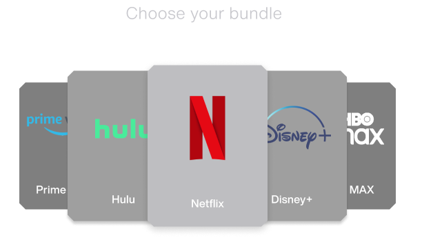
This set of problems we set out to resolve had to be considered logistically. It is unrealistic to simply create an aggregator service that combined all the major streaming platforms together and expect to offer subscriptions at a reasonable price. Working around this limitation, we proposed a subscription bundling system that tackles all three problems.
Inaccessible content
Rolling bundle of subscriptions
Users can have access to multiple streaming platforms without the hefty subscriptions.
High costliness
Limited bundling at reasonable price
By containing the service to a limited set of subscriptions, the service can be realistically given a fair price.
Choice paralysis
Customizable bundle service
Users have a selection of options for how they wish to set up their subscription bundle. Controlling their content exposure on their own terms.
Feature #1— The Bundle System
We wireframed and prototyped a bundle onboarding process for new users that lets them choose a set bundle plan offering any of our selection of partnered streaming platforms. The logic considered usability issues found from our user research.
Bundle plans to curb choice paralysis
Design group feedback showed that giving users full control of the amount of platforms available to them caused choice paralysis. Applying Hick’s Law, we opted for three standard bundle plans to minimize the user’s cognitive load.
Always giving users a way out
Based on the Norman Nielsen Group’s usability heuristic of User Control and Freedom, we ensured the users would have “a way out” of any step in the process via back buttons and multiple cancel affordances.
Bundle Renewal system
Users will also have the choice to reselect which bundled platforms they can watch on a monthly basis, giving users the flexibility of viewing more platforms than if individually purchased.
Issue #2— Weak User Content Reviews
Another problem we found across major streaming platforms is a lack of clarity and function in streaming content reviews. We ideated on features that could solve the multi-platform issue of limited review options and the unknown impact of leaving a review.

①
Little user freedom
Many platforms have little affordances for users to rate and review content they have watched, some of which only having one option to like and dislike without any known impact outside of your account.
②
Shallow descriptors, ambiguous language
Labels like “Most Liked” or “Top Rated” on content are ambiguous and hard to quantify. Many of these labels lack authorship, making it even harder for them to inform your next watch.
Feature #2— Social Media Integration for Reviews
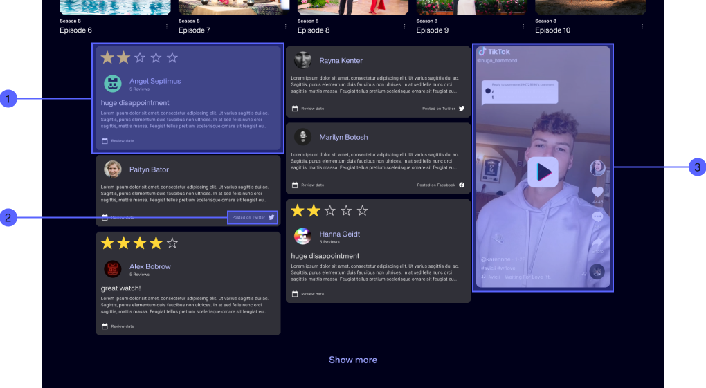
For every show and movie in our acquisition, we introduced a review section that integrates reviews from existing social media. This provides users with different forms of reviews to inform decisions on their next watch.
①
Relevant content reviews to support user judgement
Reviews of streaming platform content with star ratings and comments support users’ decision making.
②
Social media integration for stronger authorship
Reviews can be found and sourced to existing social media platforms, connecting reviews to real people to provide clarity.
③
Relevant video clips integrated via hashtags
Watching relevant video clips from social media gives users another option of deciding what content to watch.
Feature #3— Wishlisting
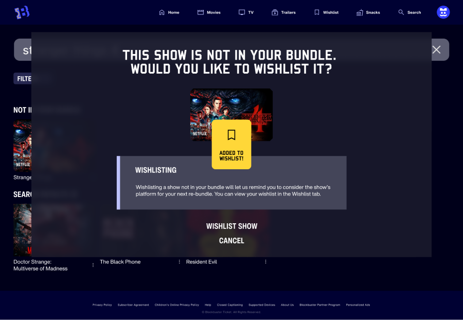
We designed wishlisting logic to address users wanting to watch content not within their bundle for the month. Users will be notified of their wishlisted shows and which platforms they are available on during their bundle renewal.
Feature #4— Snacks on Demand
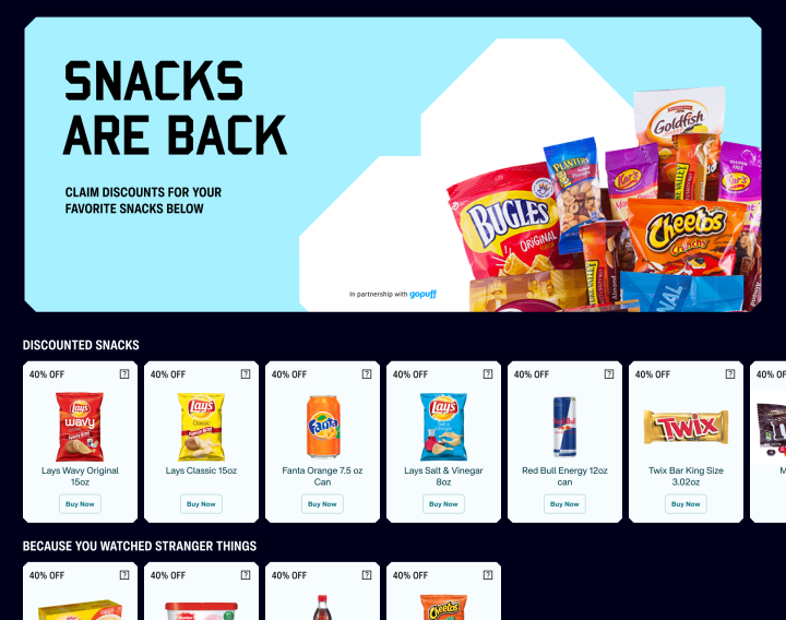
Our interview and survey findings showed that 80% of users will eat something while watching content and that Gopuff is a recognized name in the food delivery service. Seeing this business opportunity, we envisioned a partnership with Gopuff to offer discounted snacks to Blockbuster subscribers that are recommended based on the shows and movies the user has watched. In our presentation, we showed users who watched Netflix’s Stranger Things being recommended Eggo waffles and chip dips for those who watched Hulu’s Only Murders in the Building.
Feature #5— Trailer Reel
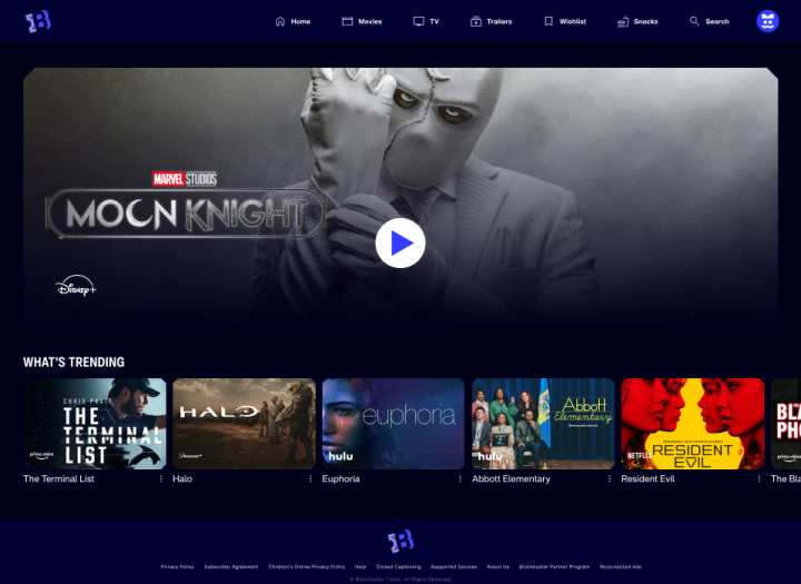
Trailers have been cited by many users to be a major deciding factor in what content they want to watch. This insight led to creating a trailer page dedicated to recent and upcoming shows and movies to help users more conveniently find their next watch.
Design System
Color Components
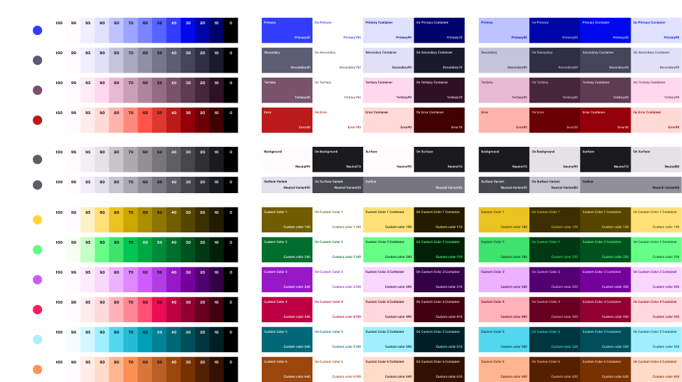
Semantic tokens documenting our color component rules based on our brand palette inspired by the SMPTE television color test bars leveraging Google’s Material 3 design system tools.
Account Customization
Customizable avatar icons created from the logo give users a more personalized experience in their accounts.
Reflections
Next Steps
With little time for such a cross-collaborative project, many ideas were still in development. After completing our product proposal, one of the first things to consider would be responsiveness across the many screen formats our users use as well as how to design the onboarding process for a unique aggregator experience.
