
Role
Principal UI/UX Designer
Design Scope
UI/UX Design
Interaction Design
UX Research
Timeline
June 2025 – September 2025
Collaboration with…
UX team
Project Management
Developers
My Role
Principal Designer owning end-to-end UI/UX across research, interaction design, and the component system:
Backed by competitive research and CRM platform best design practices, I designed CAMP’s information architecture and modules from the ground up.
I worked alongside the UX team, project management, and engineering, partnering closely to align the build with the product roadmap.
Documented every new component I created for the shared design library.
The Problem
Finvisor is an established investment research and analytics platform that advisors use for charting, fund and equity research, portfolio comparison, and client-ready proposals. But there is opportunity for Finvisor to meet rising client relations standards and gain competitive edge in the space:
No view of an advisor’s book of business or the client portfolios within it: To see which households needed attention, advisors had to leave Finvisor for spreadsheets or a separate CRM — handing competing platforms the workflow instead.
The platform held the data but not the relationships: Finvisor has the market and portfolio data, but had no visibility layer on the client and no single source of truth tying accounts, activity, and high-impact events back to the households they belonged to.
No meeting management: Coordinating client meetings and deadlines meant juggling separate calendars, a known time sink for advisors and one more reason to work outside the tool.
Our results
Project Outcomes
I delivered the full CAMP design to engineering, where it’s currently in development. In review, the product team recognized CAMP wasn’t a standalone dashboard but the natural hub of the entire product, and expanded its scope accordingly.
🧱
Set the information architecture the expansion is built on
I owned the IA and the relationships between modules — including the alerts → book-of-business anchor-link interaction that connected high-impact events directly to the client records advisors needed to act on.
🧭
Repositioned CAMP within the product
The delivery showed CAMP was central enough to anchor the product rather than sit beside it. Capabilities originally scoped as separate features, including client risk profiling, are now being routed through CAMP (currently under development).
⚙️
Documented entire feature within component library for reuse
The 120+ components and interactions I built and documented — accordions, badges, cards, and a full calendar component — matured the product's design language to serve as the foundation for later iterations.
Design Solutions
Module Designs & Design Hurdles
CAMP is a client asset management platform built around a modular system of financial data panels — each surfacing a different view of an advisor's book of business. The design challenge was to make dozens of distinct modules feel like one cohesive tool rather than a collection of independent dashboards. A shared visual language and deliberate information hierarchy kept advisors oriented across the full surface. The guiding question throughout: what does an advisor with 100+ clients need to see, and when?
Alerts Module
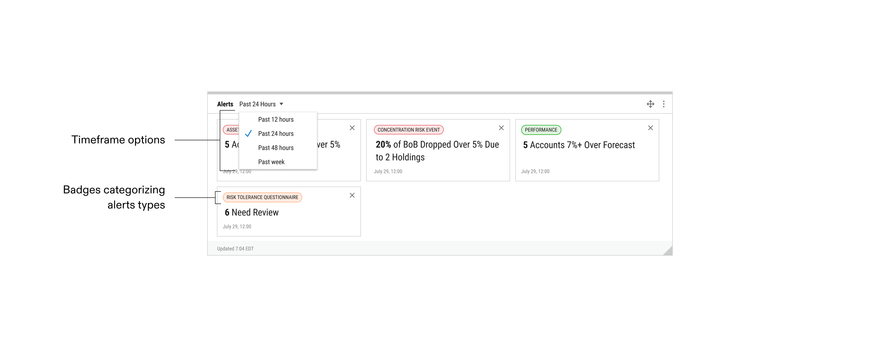
alerts module: surfaces actionable financial events for advisors by category
Book of Business
Module
Advisors want to see their book of business visualized to be able to flag issues requiring action and ensure regulatory compliance. Serving as the advisor's command center, the book of business module gives financial advisors a high-level view of their book of business. We opted for a table of customizable financial metrics as columns and the advisor's client accounts as individual rows. The table is treated with as little visuals as possible to reduce visual noise and surface the data immediately. Data points fitting alert requirements are highlighted for advisors to take immediate action.
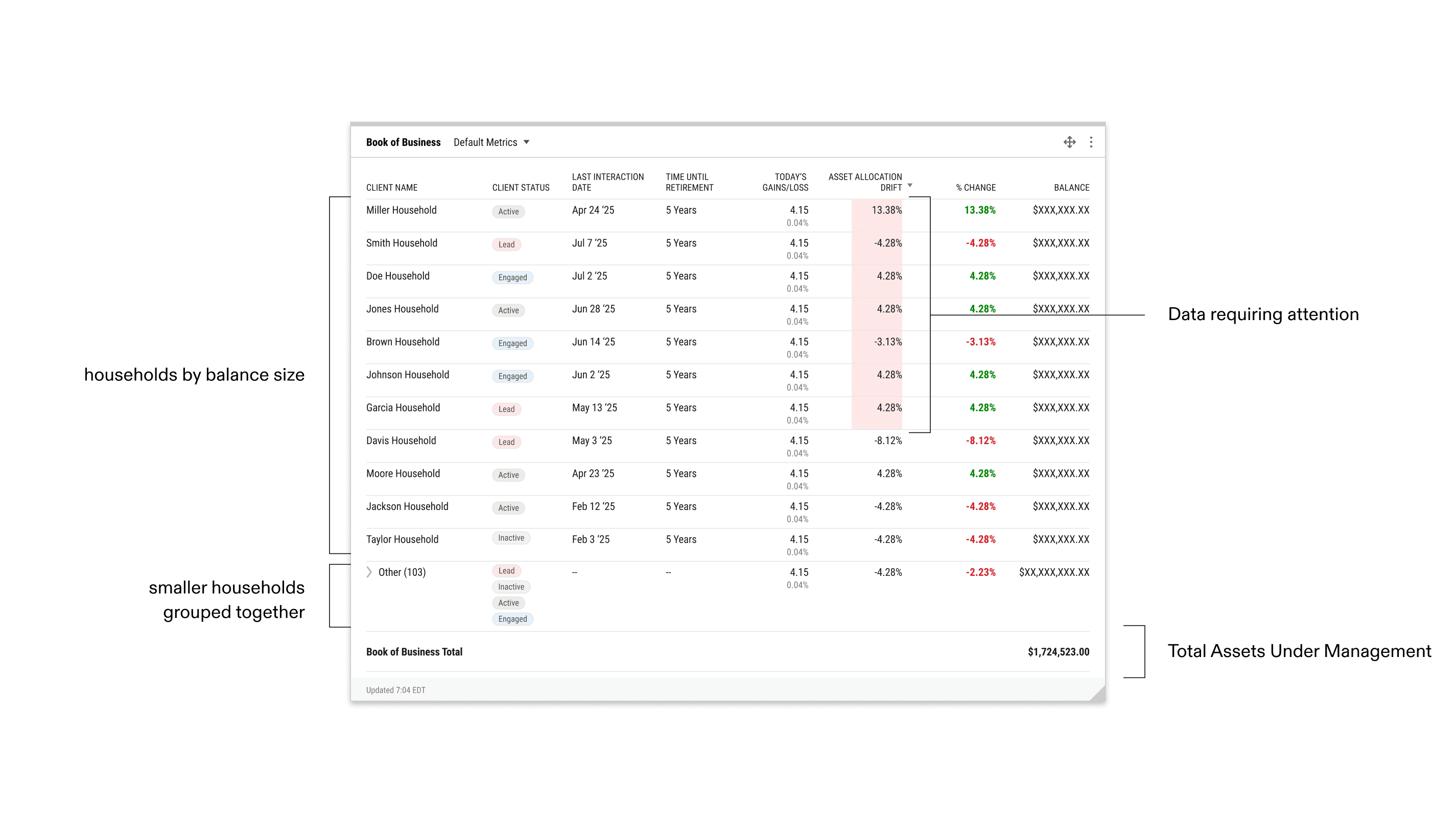
book of business module
Design Problem: Limitations of Real Estate
User Pushback + Solution
Project management needed other higher-level data visualization modules to be above the book of business that advisors would want to see first. This led to the actual portfolio data being too far down the page.
I added interactions to the alerts module that linked advisors directly to the book of business, creating a workflow that takes advisors from seeing high-level actions down to the book data behind it.
User Pushback + Solution #2
Now, when an alert populates the alerts module at the top of the page, the advisor will be able to click on the alarm which anchor links to the book of business where the relevant data is highlighted.
However, advisors said they want to go to the deepest level of data possible — the portfolio data page that the book data pulls from. To solve this, I proposed converting all table cells into links to the relevant portfolio pages, allowing advisors to see underlying portfolio data in two clicks.
advisor flow: book of business alerts → book of business module → underlying portfolio data (two clicks)
Snapshot Metrics
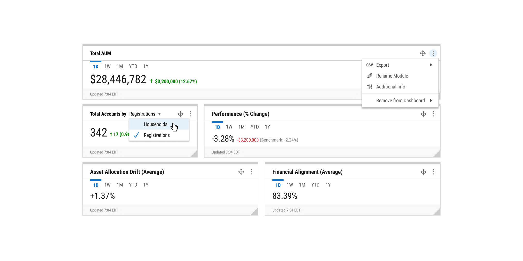
snapshot metric cards with responsive sizing for fully customizable layout
Design Challenged: Lowering Onboarding Friction
The Problem
After the first version shipped to internal users, consistent feedback on the feature asking for too much upfront was hurting adoption.
Alongside the PMs, I dug into which inputs were causing friction. Talking with users, some say they didn’t have or need that data uploaded, while some data — like risk profiles — they absolutely wanted but couldn’t fill in immediately due to client back-and-forth over days or weeks. The problem was too many required inputs right at the gate.
The Solution
I made the lowest-priority required inputs optional but not hidden. These fields still mattered to plenty of advisors, so they couldn’t be buried. I designed empty states for the newly optional modules that resolve the conflict between advisors that (1) don’t have or need the data (2) want to enter it immediately and (3) want to input later on their own timeline.
Now the advisor can onboard almost immediately, with the empty modules signalling what’s there, non-invasively inviting them back to complete it when they’re ready.
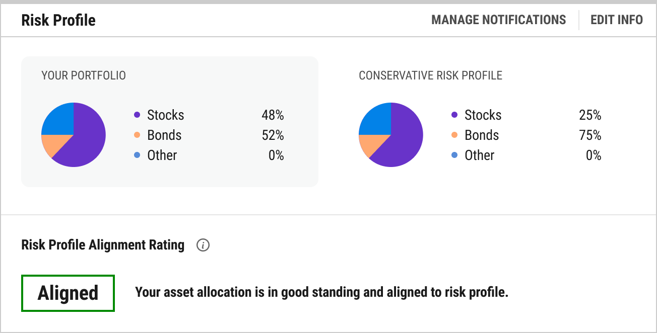
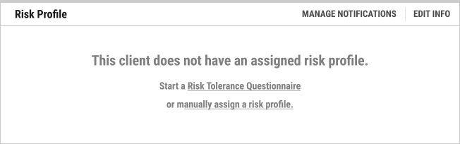
Risk Profile module: populated by data advisors may not have on hand
Risk Profile module empty state to lower onboarding friction while signalling the data can be inputted at any time
Calendar Module
External calendar tools have no concept of an advisor’s workflow so client meetings, market events, and internal team activity all live in separate places.
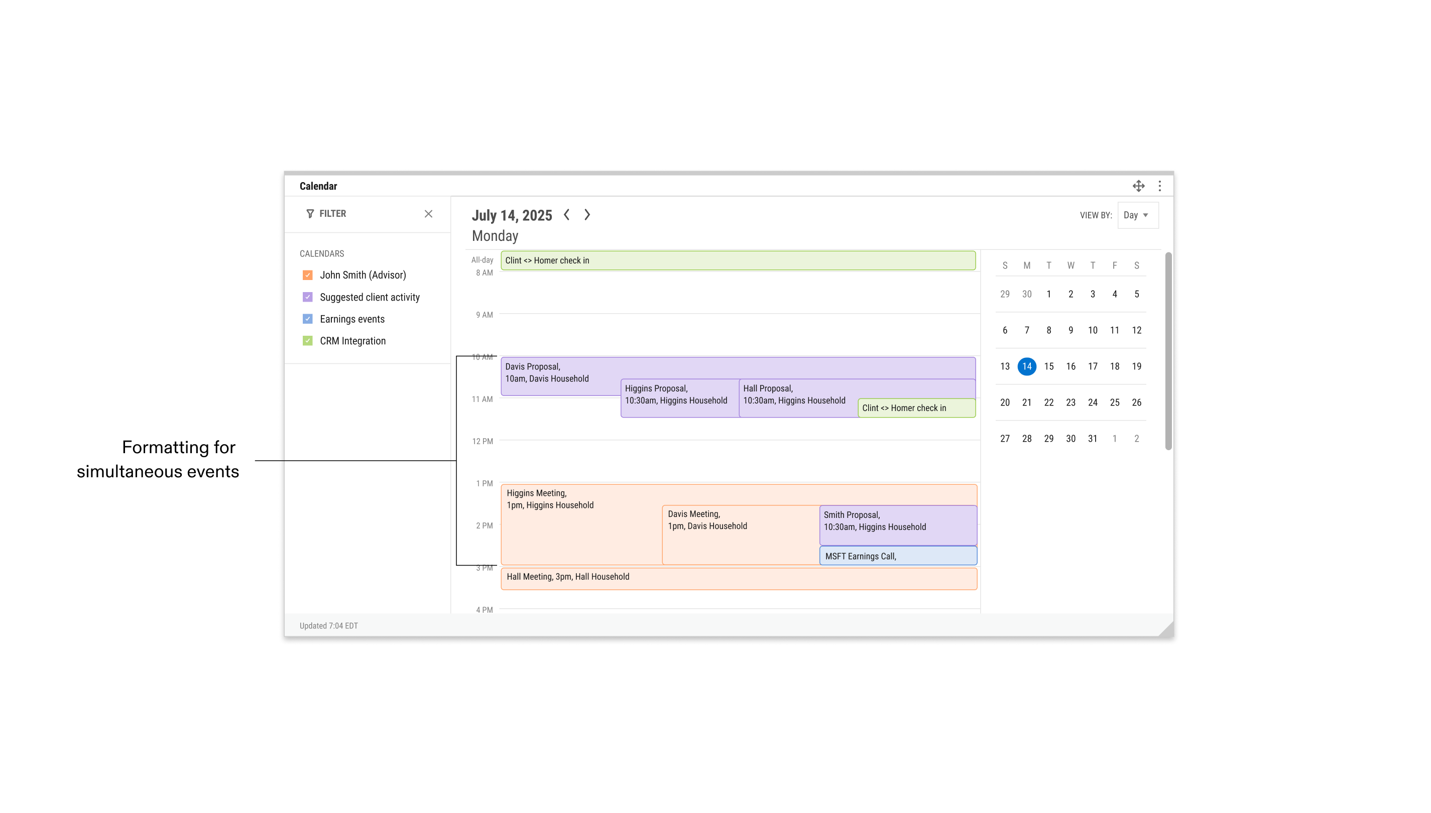
I designed the calendar to be advisor-specific, rolling external calendars containing client meetings and external financial events into one event hub. Advisors also wanted continuity on their client actions to be visible. After understanding how advisors interact with their clients, I designed a client suggested activity setting that can add reminders to advisor’s calendars (ex: follow up on a client meeting after 4 weeks). Where it made sense to, I followed the conventions of the calendar interfaces advisors already use every day to reduce friction and onboarding lag.
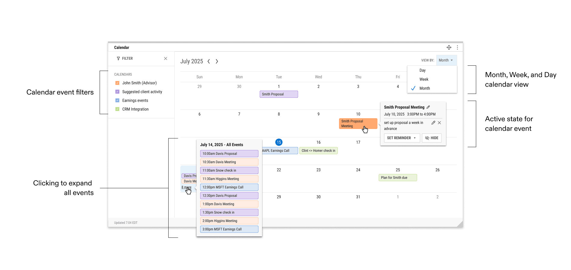
calendar module integrates advisor events and meetings, external financial events, and suggested activities into one module
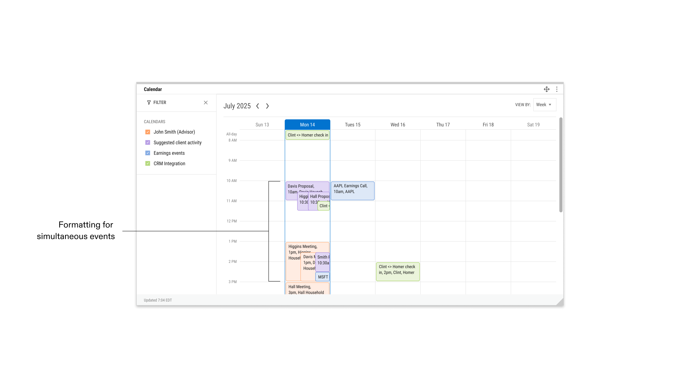
week view of advisor and financial events and suggested activities
day view of advisor and financial events and suggested activities
The central module defines the product
CAMP started as one feature and became the product’s hub with capabilities like client risk profiling now being routed through it, shaping the platform’s architecture far beyond the original brief. I learned that the successful launch of a product MVP can result in taking a step back due to new learnings from the design process.
Lower the barrier before you defend the data
Adoption can be decided in one glance. When too many required inputs stalled advisors, the fix wasn’t removing data but understanding that advisors wanted different things on different timelines. Friction at onboarding can outweigh almost any usability issue.
Bring PM in early, not at handoff
Sharing rough iterations with project management revealed advisor mental models early, allowing us to pivot the product with enough time, avoiding wasting several weeks on damage control and last-minute fixes.